Whether you’re an expert or a novice in project management, you’ve probably heard of Gantt Charts before.
Nothing can beat the good old Gantt charts for providing a better overview and clear understanding of the project schedule.
When it comes to keeping track of projects and tasks, visual representations work well, and that’s what Gantt Charts help you do. They aid in the visualization of projects, tasks, and milestones, allowing you to plan projects more effectively and execute them faster.
Although a best Gantt chart software helps you visualize projects from start to finish, one wrong move can turn them into a mess. That’s why it is important to take every step carefully.
If you are curious about how to create a Gantt chart? You’ve come to the right place.
In this article, we’ll explain how to make a Gantt chart in Excel. Also, we’ll highlight an effective, alternative tool to create better Gantt charts. Since Gantt charts aren’t a piece of cake, let’s first dive into the basics.
Let’s get started.
What is a Gantt Chart?
A Gantt chart is a popular project management tool that aids in planning and scheduling projects of all sizes. It provides a visual representation of the project’s timeline and assists project managers, stakeholders, and team members in understanding:
- A project’s roadmap
- Task progress
- Key milestones
- Work dependencies
- Resources required
- Risks involved, and much more
A Gantt chart, like most charts, has two axes. The horizontal axis represents the timeline for all project tasks. On the other hand, the vertical axis lists the activities or tasks that must be completed to finish the project.
In a nutshell, a Gantt chart is a quick and easy approach to describe how long it will take to complete a project on time and within budget. It keeps your project team as well as stakeholders on the same page from the start.
How to Make a Gantt Chart
Creating Gantt charts in Excel is one of the most common ways to represent your project plan visually. A Microsoft Excel spreadsheet is an indispensable business tool. Let’s see how you can use it to create an amazing Gantt Chart for your projects.
Follow the five steps given below to build the Excel Gantt chart from scratch.
Step 1: Create a table with the project’s data.
Open a new Excel Spreadsheet and make a table that contains your project’s primary information like:
- List of Tasks along with their descriptions
- Start Date for each task
- End Date for each task
- Duration of each task
Here’s a sample spreadsheet for a Mobile App Development Project.
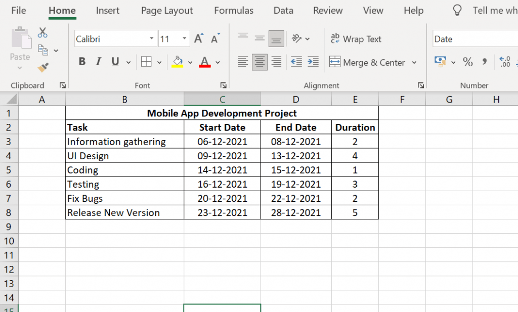
Source: proprofsproject.com
Step 2: Add a Stacked Bar Chart
Since Excel does not have an inbuilt Gantt chart, we’ll create one using a stacked bar chart.
To do that, follow these steps:
- Stay on the same sheet and click on any empty cell
- Click on the Insert Tab
- Select Bar Chart Option
- Choose Stacked Bar Chart.
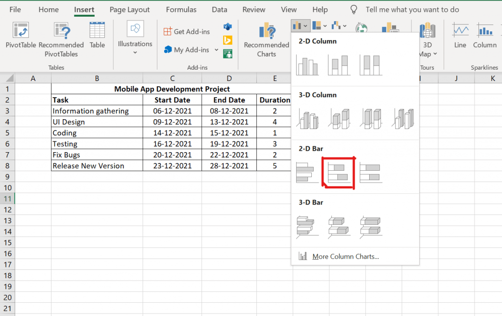
Source: proprofsproject.com
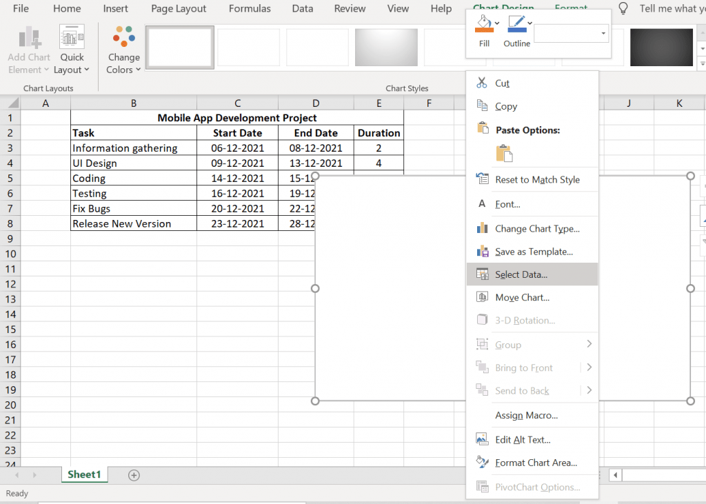
Step 3: Add Duration Data to the Bar Chart
Source: proprofsproject.com
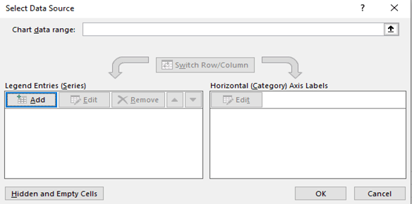
Next, we’ll add task data to the chart. For this, right-click on the chart and choose the Select Data option.
The Select Data Source window will appear, where you will see two options:
- Legend Entries(Series): here, we’ll add the start task date and duration
- Horizontal Axis Labels that will display task names.
Source: proprofsproject.com
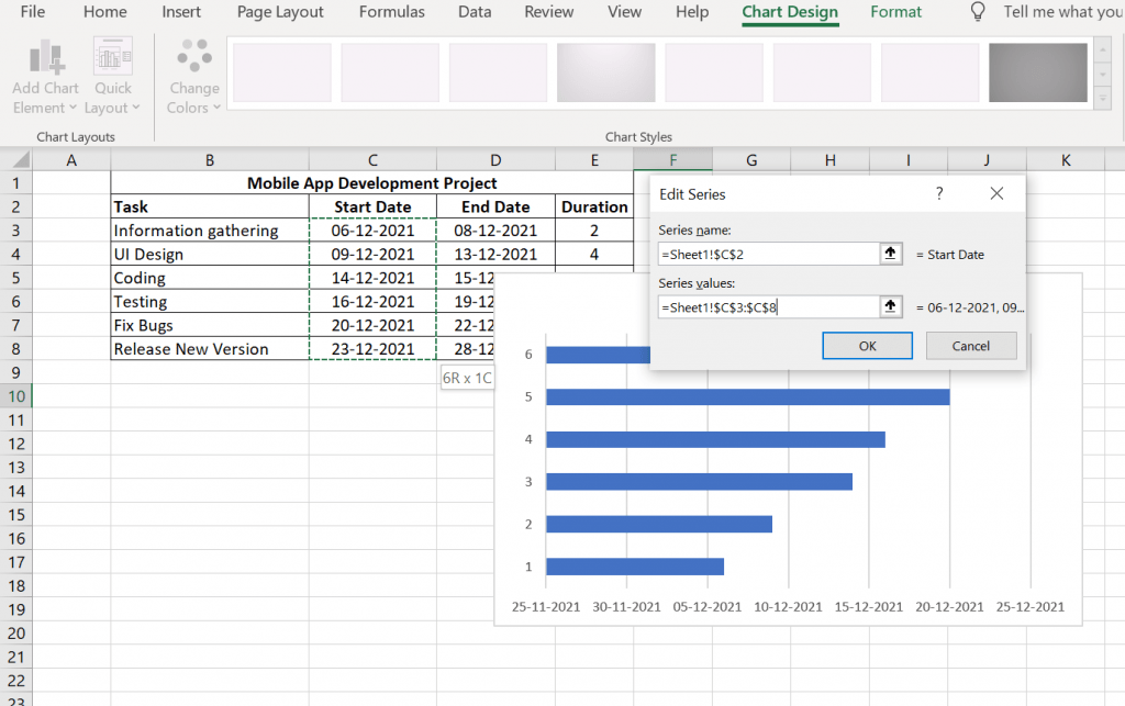
To add the task start dates and durations, click the Add button in the Legend Entries (Series) section.
Task start date:
- Select the Series Name option and choose the Start date cell
- Set the Series values to the cell range containing the start dates for the tasks.
Source: proprofsproject.com
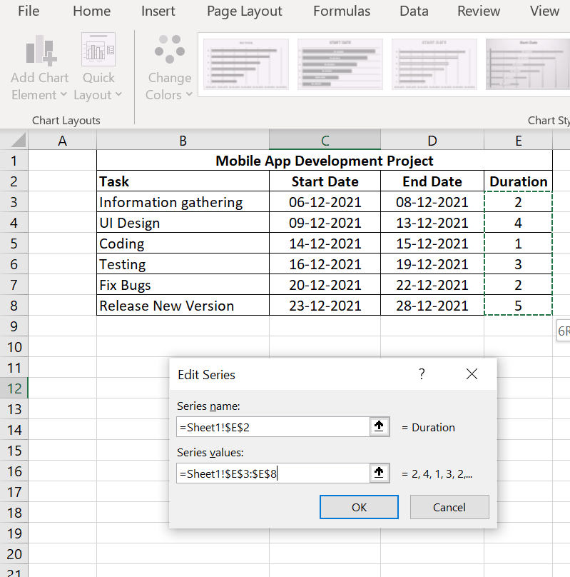
Task durations:
- Select the Series Name option and choose the Duration cell
- Set the Series values to the cell range containing the task durations.
Source: proprofsproject.com
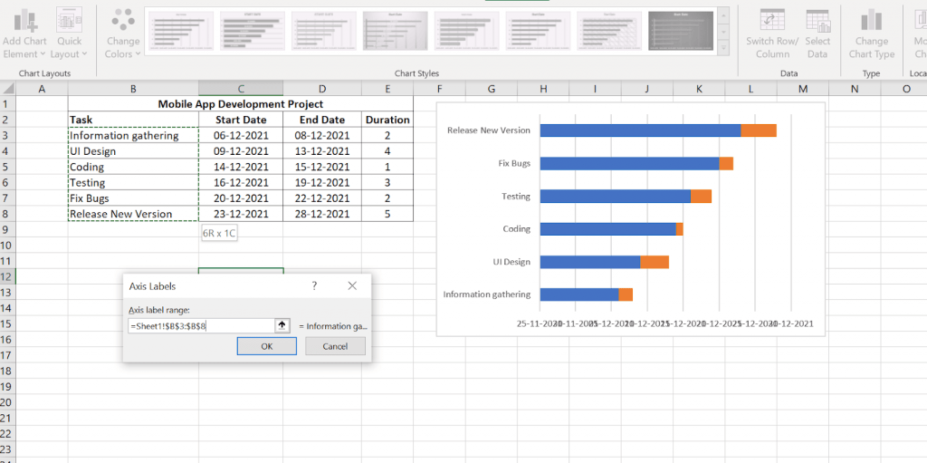
Next, select the Edit option under the Horizontal (Category) axis labels to add task names to the vertical axis.
Source: proprofsproject.com
Step 4: Format the Chart
The stacked bar is now ready. Your tasks are laid out on the chart as blue and orange bars. But, it doesn’t look like a Gantt chart. Let’s format the stacked bar to make it look like a Gantt Chart.
Right-click on the blue part of the bar. Then click on the Format Data Series option to open the Formatting dialog box.
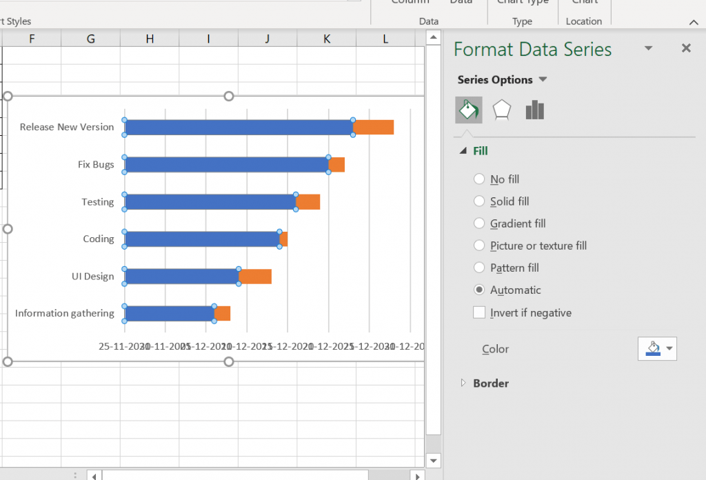
Source: proprofsproject.com
Next, set the Fill option to No fill.
You’ll notice how it looks like a Gantt Chart now.
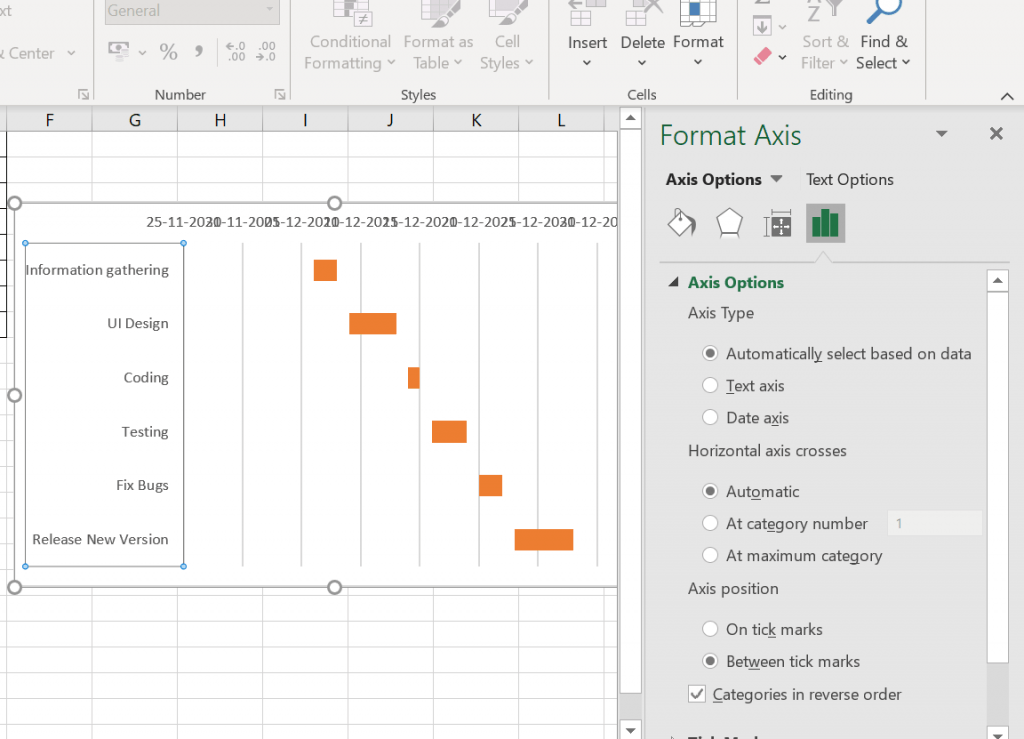
However, something is still not quite right.
You must reverse the order of your project tasks, bringing ‘Information Gathering’ to the top and ‘Release New Version’ to the bottom.
To resolve the first problem, right-click on the vertical axis.
Then, select the Format Axis tab from the context menu to open the Format Axis dialogue box.
Then,
- Click Axis Options.
- Choose Categories in reverse order option.
The tasks should now be displayed in the correct order.
Source: proprofsproject.com
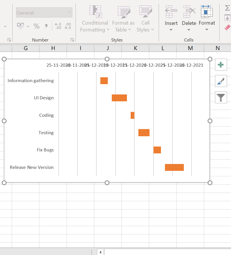
Your Gantt Chart is now complete.
You can customize your Gantt chart to your liking. Simply right-click on the Gantt bars and choose Format Data Series to access a plethora of options.
Source: proprofsproject.com
Gantt chart in Excel is suitable for small projects with a limited number of tasks. If you are working on a big project with multiple tasks, it becomes tedious and time-consuming to follow all these steps again to add a new task or change its duration. Even task dependencies are hard to represent within the Excel chart.
Also, Project members cannot work simultaneously to populate tasks in the sheet.
But guess what? We have a way out!
By using a simple and robust Gantt chart software like ProProfs Project, you can easily create a Gantt Chart in just a few minutes! But before we come to that, let’s discuss in detail what things you need to make a Gantt chart and how to use one.
What do you need to create a Gantt chart?
You can’t create a Gantt chart without knowing its essential elements. Here are some of the top elements that are critical to create a Gantt Chart.
- Tasks: In a Gantt Chart, project tasks and task descriptions are placed along the vertical axis.
- Timeline: A dateline that runs across the chart’s horizontal axis and is broken down into days, weeks, and months.
- Bars: On the Gantt chart, each bar represents a task. Thanks to the timeline, you can visualize each task with its start date, end date, and duration.
- Milestones: They represent important dates, events, or goals in the project schedule, achieving which mark significant progress in a project.
- Resources: For each task, one or more team members may be assigned to complete it.
Read More: 14 Best Product Roadmap Software to Streamline Project Management
What to consider when making a Gantt chart?
When you know all the elements discussed above, it’s essential to answer a few simple questions before creating a Gantt Chart. These questions can assist you in gathering all of the necessary information to create a project plan before finally sitting down to make your chart.
- What are the most crucial project outcomes?
- How will we meet those goals and meet the deadline?
- What are the milestones?
- Are there any dependencies between the various tasks that could affect the deadline?
- What is the composition of the project team, and what role will they play in the deliverables?
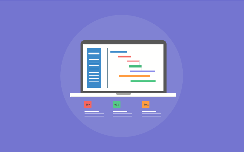
Gantt chart example
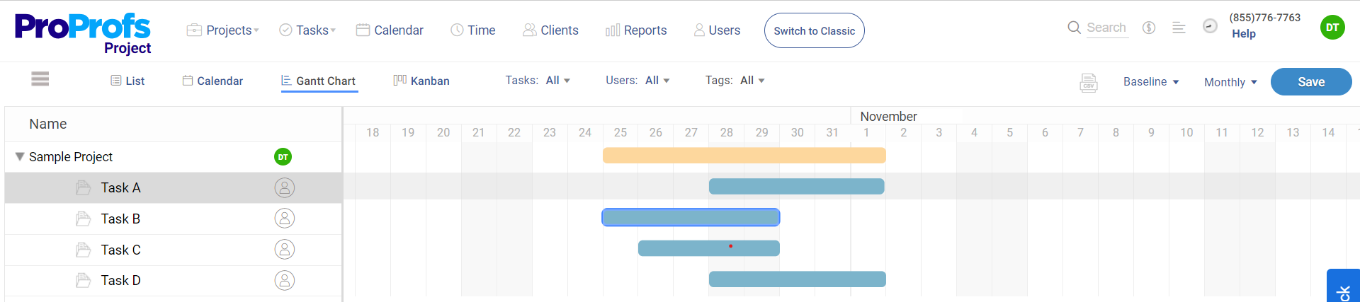
This is a simple gantt chart example created using ProProfs Project. As you can see, the Sample Project has four tasks (Task A, B, C, and D), and each task is depicted on the chart by blue horizontal bars.
These bars clearly show the start and end date for each task. And the total span of the project is depicted by an orange bar. The percentage on the bar represents how much the task is completed. For instance, in the image above, you can see that Task B is 90% completed. Once Task B is completed, Task A will start as it is dependent on Task B. These are basically task dependencies that tell you the sequence you should follow while taking up tasks in a project to ensure successful delivery.
Read More: What is Task Management & How Does a Software Help
How To Use Gantt Charts
Let’s look at some simple ways to use a Gantt chart to manage and track your projects.
A. Team Collaboration
Collaboration and communication are imperative for the success of any project. When project files and updates are dispersed across multiple email threads and platforms, it isn’t easy to get a good sense of what needs to be done and how close you are to completion. With a Gantt Chart, you can streamline communication by bringing all tasks and activities to a single place and allowing teams to work in sync using features like comments and feedback is one of the best advantages of gantt charts.
B. Team Workload Management
When your team is overburdened and overwhelmed, completing any project on time and within budget is challenging. A Gantt chart visualizes everyone’s work on a timeline, allowing you to see how tasks stack up across your projects. You can check and adjust workloads directly from your Gantt chart to avoid overbooking your team as you schedule new tasks.
C. Reporting Tool
The chart is famous among project managers because it is an excellent reporting tool that clearly outlines completed tasks, tasks in progress, delays, and tasks that need to be completed. It provides a 360° view of all your project activities, team workload, progress made on a task, and much more in a visual and engaging way. This makes it easy for teams to make context-driven decisions at every stage of the project.
D. Outlines the interdependence of project tasks
The Gantt chart allows you to see how the project tasks are interconnected. The connection makes it simple to switch tasks without disrupting the project’s progress. The Gantt Chart’s dependencies feature makes it simple to keep tasks connected even when the timeline changes.
E. Track project status
Another important area where Gantt Charts play a crucial role in tracking project status. Clients, bosses, and other project stakeholders, after all, expect you to keep your promises regarding budgets and deadlines so maintaining the transparency of a project’s status is essential.
With Gantt Charts, you can monitor tasks to ensure that you are on track to finish work on time and within budget. If things start to go off the rails, you can make adjustments in the Gantt chart to get things back on track.
Create Gantt Charts Effortlessly With ProProfs Project
Most people understand how to make charts in Microsoft Excel. As a result, it’s a natural choice when it comes to creating a Gantt chart.
However, as you can see, creating a Gantt chart in Excel is a difficult task. Collaboration with stakeholders and team members is also nearly impossible. Furthermore, it isn’t easy to keep the Excel sheet up to date all the time.
That’s where Proprofs can help. So, how can you add the Gantt chart view in the Proprofs Project?
- Access a project on your ProProfs Project dashboard by clicking on it.
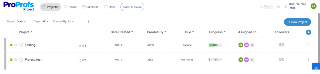
- You are currently in the Classic View. To switch to the Gantt Chart view, click View and then Gantt Chart.
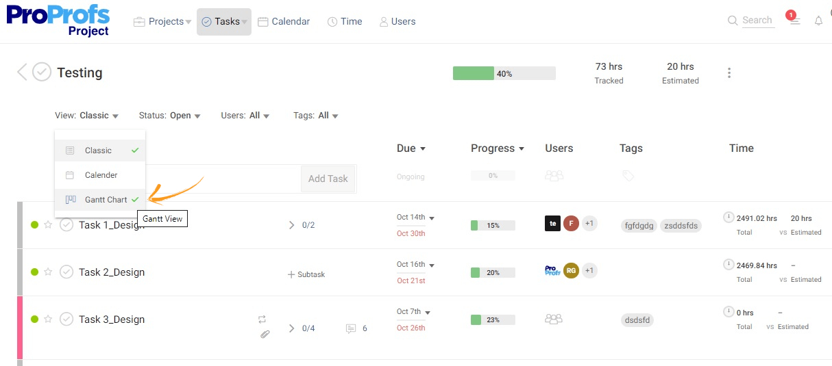
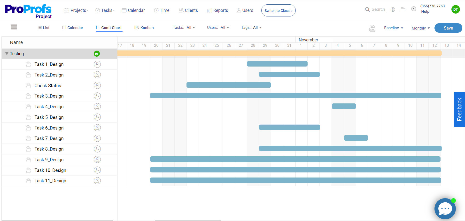
- You will get a view as shown in the image below.
On the left, the project name (Testing) and its tasks/subtasks are shown vertically. Each of these activities is represented by a progress bar. The orange bar at the top represents the entire project, while multiple blue bars represent all of the tasks and subtasks. The progress bars provide a start and finish date and the duration of a project, task, and subtask.
Voila, you are done!
With a robust Gantt chart tool like Proprofs, you can:
- Visualize a project’s tasks and subtasks.
- Schedule and track the progress of a project.
- View each activity shown by its respective progress bar, with a start date and end date
- Increase or decrease an activity’s duration by stretching a progress bar
- Easily add and manage task dependencies.
- Add and delete tasks and subtasks
- Determine the start and finish dates of an entire project.
- Assign tasks to members of your team and monitor their progress as they complete work.
ProProfs Project is the ideal project management software that enables you to build Gantt charts even when you are not an expert. You can even add/remove tasks and subtasks, rename a project, tasks, and subtasks, stretch and move progress bars, and much more with this Gantt Chart tool.
FREE. All Features. FOREVER!
Try our Forever FREE account with all premium features!