I can spot a doomed project from a mile away. Timelines slip, tasks trip over each other, and the same questions echo in every meeting: “Who’s on this?” “What’s next?” “Why are we behind?” By the time you hear those on repeat, you’re already bleeding time and budget.
The hard truth? Most projects don’t fail because the team isn’t smart or skilled; they fail because no one can actually see the full picture.
You need visual command. The right project management chart doesn’t just track work; it turns chaos into order, confusion into clarity, and your project into something you can actually deliver with confidence. Once you’ve seen how fast the right project management diagram changes the game, you’ll never go back to managing blindly.
If you’re new to project management, this video can be a good resource –
What Is a Project Management Chart?
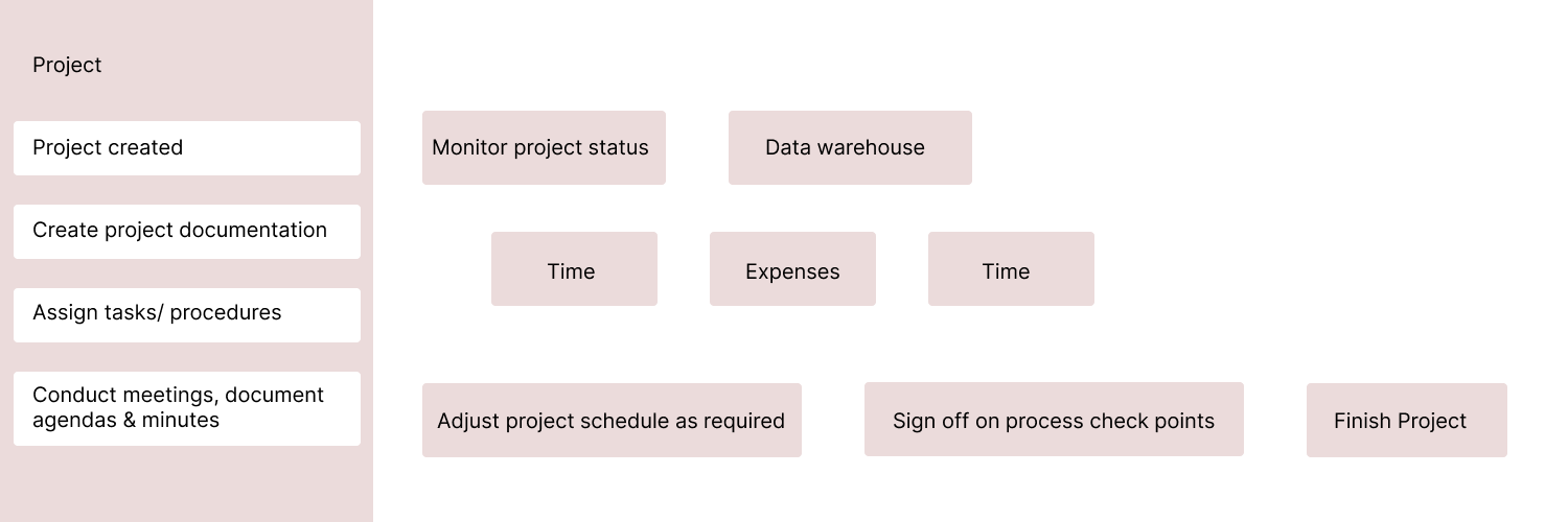
A project management chart is your project’s visual control room. It takes all the moving parts, such as tasks, dependencies, and deadlines, and turns them into a format your team can quickly read and act on.
Instead of sending your HR team a long document about the office relocation, you can give them a visual roadmap. They can see in seconds what is completed, what is in progress, and where potential bottlenecks might appear.
The right chart serves as a single source of truth that keeps everyone aligned, improves communication, and helps you deliver on time and within budget.

19 Essential Project Management Charts & Diagrams (With Real-World Applications)
I’ve curated this list based on 15+ years of project management experience and real feedback from project managers handling everything from software launches to construction projects. Each one of them serves a specific purpose, and I’ll show you exactly when and how to use project management charts.
Let’s get started.
1. Gantt Chart: Your Project Timeline Backbone
The Gantt chart remains the gold standard for project timeline visualization, and for good reason. I use horizontal bars to represent tasks, with their length showing duration, and dependencies clearly mapped between related activities.
When I recommend using Gantt charts:
- Linear projects with well-defined tasks and clear dependencies (product development, construction, software releases)
- When you need to communicate progress to executives or clients who want to see the “big picture”
- Projects where understanding the critical path is essential for success
Ideal Use Cases: Product launches, construction projects, and compliance-driven initiatives.
Pros:
- Universal understanding across all skill levels
- Excellent for tracking real-time project progress
- Built into most project management software (including ProProfs Project)
Cons:
- Can become overwhelming with 50+ tasks
- Limited flexibility for resource allocation visualization
- Requires constant updates to remain accurate
2. Flowchart: Mapping Processes for Efficiency
Flowcharts are my go‑to when I need to break down complex processes into clear, logical steps. I use standard symbols so decision points, actions, and outcomes are immediately recognizable.
I create them for employee onboarding, quality assurance workflows, customer journey mapping, and troubleshooting protocols. Once mapped, I test the process with real users before finalizing. This ensures the flowchart is not just visually appealing but also practical in guiding actions and avoiding bottlenecks.
Ideal Use Cases: Onboarding new employees, troubleshooting technical problems, and mapping out customer journeys.
Pros:
- Excellent for process visualization and identifying bottlenecks
- Useful for documenting complex standard operating procedures (SOPs)
Cons:
- Can get complex for intricate processes
- May require additional explanation for non-technical audiences
3. PERT Chart (Program Evaluation and Review Technique): Handle Uncertainty Like a Pro
When I work on projects where task durations are uncertain, such as research and development initiatives, I rely on the PERT chart. This project management diagram was developed by the U.S. Navy in the 1950s and uses three time estimates, optimistic, pessimistic, and most likely, to calculate realistic completion ranges.
I find PERT charts invaluable for research and development projects, first-time implementations with many unknown variables, and situations where accurate time estimation is critical for success. They give me a structured way to account for uncertainty while still setting achievable deadlines.
My go-to calculation for the expected time is:
Expected Time = (Optimistic + 4 × Most Likely + Pessimistic) ÷ 6
By applying this formula, I can create a reliable project management chart that helps stakeholders understand both the best-case and worst-case scenarios. This improves planning accuracy and ensures resources are allocated with confidence.
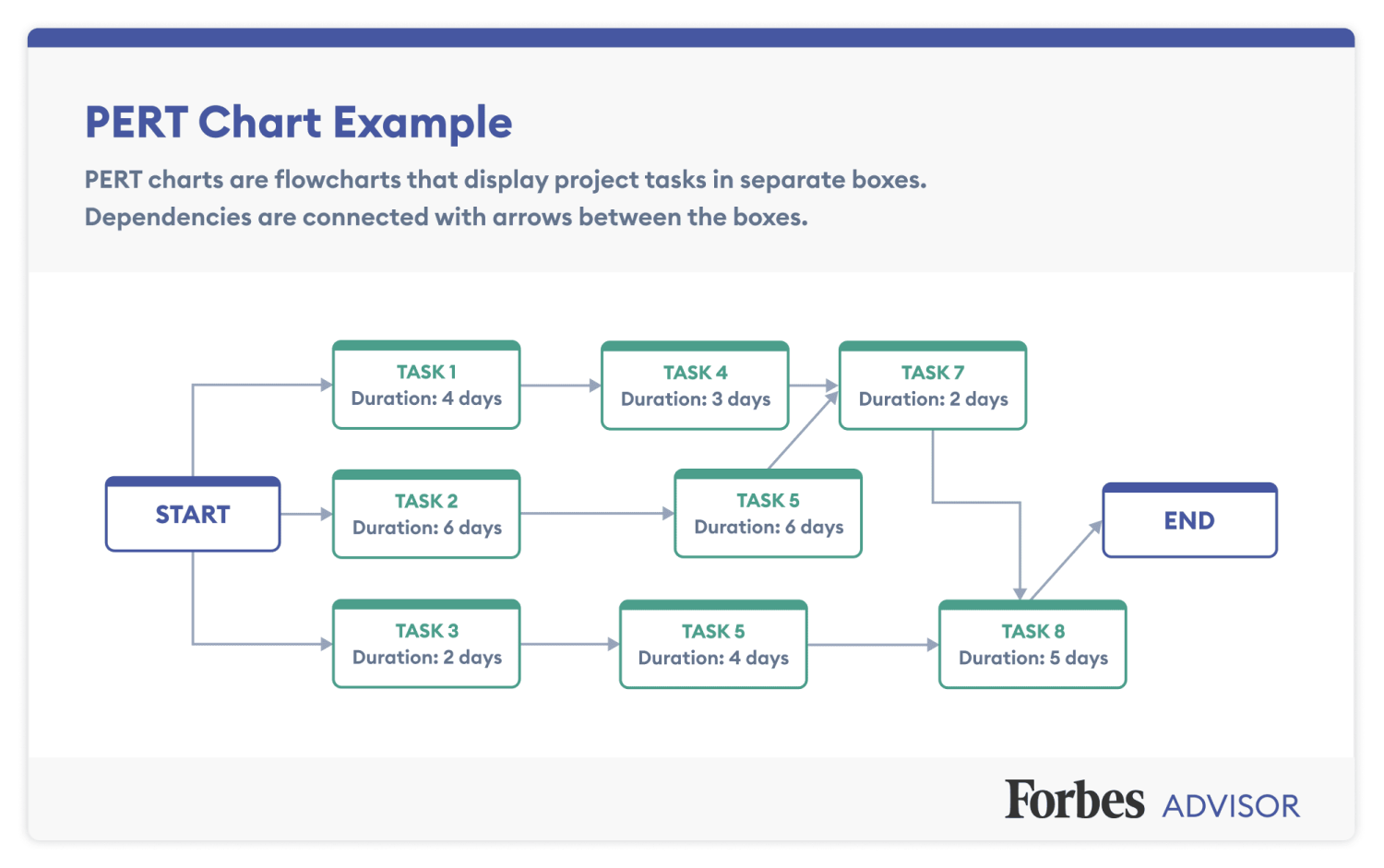
Ideal Use Cases: Complex projects with a high degree of uncertainty in task durations (e.g., research & development) and projects with tight deadlines where understanding potential delays is crucial.
Pros:
- Accounts for real-world uncertainty
- Provides confidence intervals for completion dates
- Helps identify and mitigate potential delays
Cons:
- Requires statistical understanding
- More complex than standard scheduling tools
- Can overwhelm teams unfamiliar with probabilistic thinking
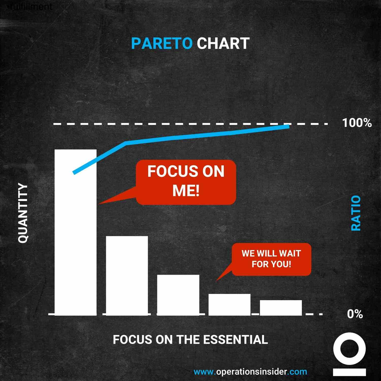
4. Pareto Chart: Applying the 80/20 Rule for Maximum Impact
A Pareto chart helps me pinpoint the few causes responsible for most problems. I order bars by frequency, so the most common issues are immediately visible.
In one software project, Pareto analysis revealed that 3 types of bugs caused 73% of user complaints. By focusing on those first, we increased user satisfaction by 60%. Whether I am addressing quality issues, customer complaints, or resource allocation, a Pareto chart keeps my focus where it matters most.
Ideal Use Cases: Identifying root causes of quality defects, analyzing customer complaints, and prioritizing sales efforts.
Pros:
- Prioritizes problem-solving efforts
- Helps identify areas for maximum improvement
Cons:
- Limited to showcasing a single category and its contributing factors
- Ignores interdependencies between causes
5. Cause-and-Effect Chart (Ishikawa Diagram): Root Cause Detective Work
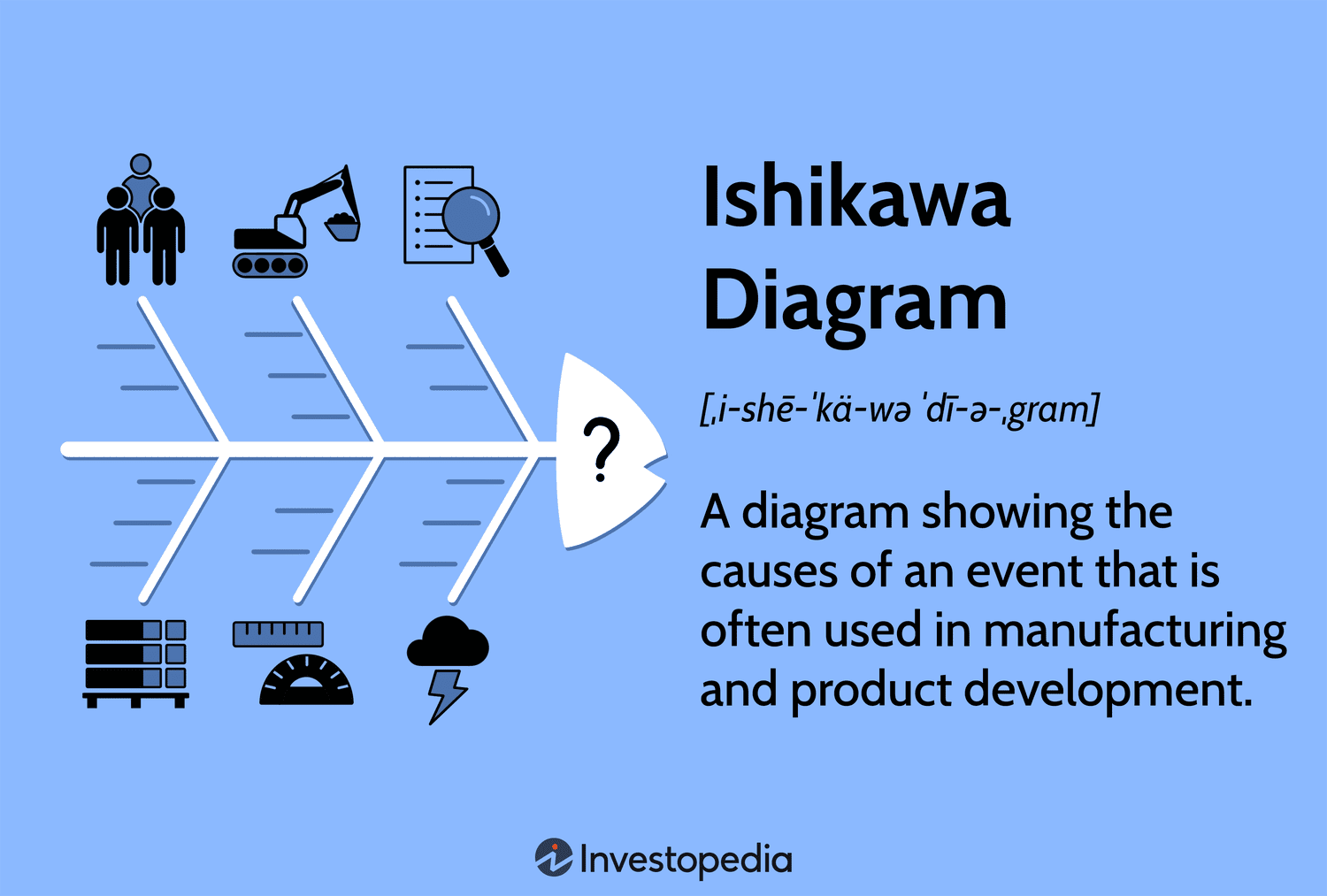
When a project is hitting recurring problems, I use a cause‑and‑effect diagram, often called a fishbone or Ishikawa diagram, to systematically investigate possible causes. I break them into categories like People, Process, Materials, Machines, Methods, and Environment.
I start by defining the problem in clear, measurable terms. Then, I work with the team to brainstorm possible causes in each category, using the “5 Whys” technique to dig deeper until we identify the real root. This approach prevents the common mistake of treating symptoms instead of fixing the underlying issue, which is crucial for sustainable improvements in any project management process.
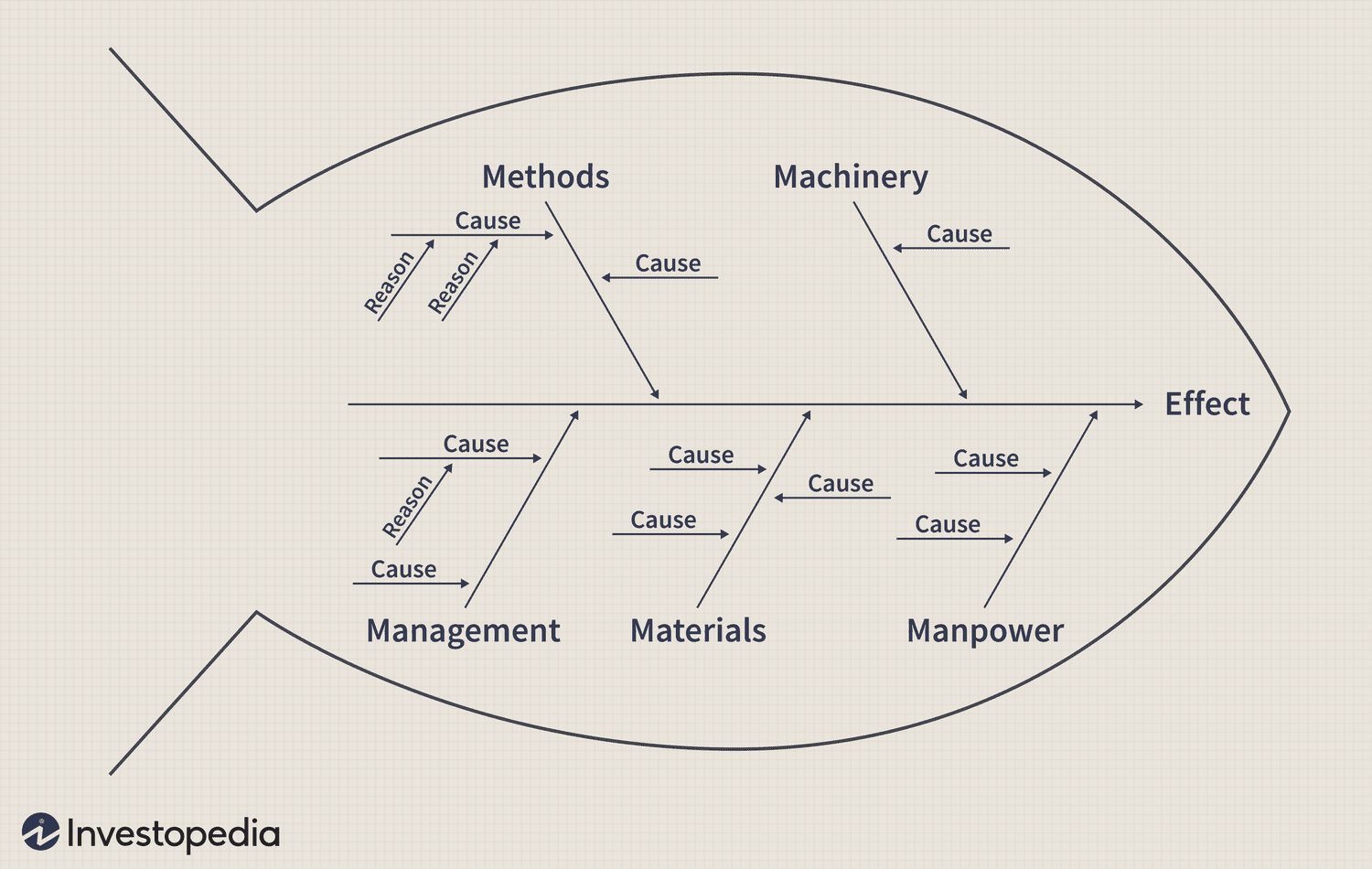
Ideal Use Cases: Identifying root causes of product defects, troubleshooting technical issues, and analyzing project delays.
Pros:
- Excellent tool for root cause analysis
- Promotes team collaboration
Cons:
- Can become unwieldy with complex problems
- Subjective interpretation of causes
6. Kanban Board: Visual Workflow Mastery
A Kanban board is one of the most effective project management charts for teams that need to see work moving in real time. If you have ever managed sticky notes on a whiteboard, you already understand the concept. I organize tasks as cards that move through columns representing workflow stages such as To Do, In Progress, Review, and Done.
I find Kanban boards work best when teams need continuous visibility and quick adjustments. They are especially effective for Agile software development, marketing campaigns with frequent updates, remote teams that rely on real-time collaboration, and any project where spotting workflow bottlenecks early is critical.
I always set limits on work-in-progress (WIP) items for each column. For example, keeping “In Progress” to three or four tasks at most helps the team stay focused, avoid overload, and maintain quality output.
A well-structured Kanban board is more than a visual chart. It becomes a living project management diagram that keeps stakeholders aligned, reduces wasted effort, and supports consistent delivery.
Watch this video: What is Kanban Board? –
Ideal Use Cases: Software development, marketing campaigns, any project with a visual workflow, and frequent task updates.
Pros:
- Simple setup, immediate team adoption
- Real-time bottleneck identification
- Flexible for changing priorities
Cons:
- Limited task detail without clicking into cards
- Can oversimplify complex dependencies
- Requires discipline to maintain WIP limits
7. Control Chart: Monitoring Performance Boundaries
A control chart is my preferred tool for spotting variations before they turn into problems. By plotting key process metrics against statistically determined upper and lower limits, I can immediately see if a process is stable or drifting toward trouble.
I use control charts to monitor project cost, schedule adherence, defect rates, and productivity trends. For example, if my schedule performance index starts to dip below the control limit, I investigate early instead of waiting for a deadline to slip. A control chart turns raw data into an early‑warning system that helps me keep a project management table of metrics well within safe limits.
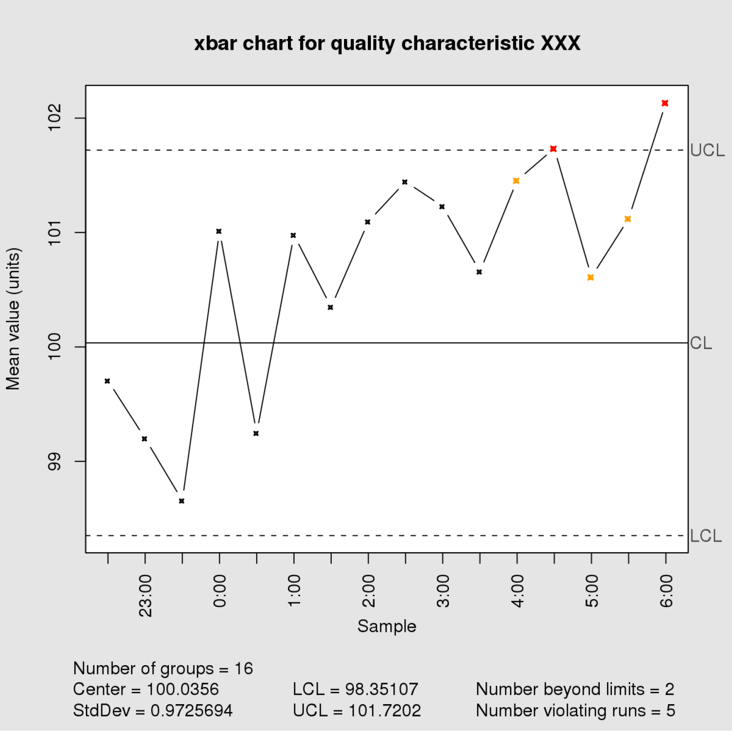
Ideal Use Cases: Manufacturing processes, monitoring project costs or schedule adherence, tracking software defect rates.
Pros:
- Proactive monitoring of project performance
- Helps identify and address issues before they snowball
Cons:
- Requires some statistical knowledge to set up and interpret
- May not be suitable for all project types
8. RACI Matrix: End the “Who’s Doing What?” Confusion
The RACI matrix removes the finger‑pointing and confusion I often see in projects. For each task, I assign team members one of four roles: Responsible (does the work), Accountable (ensures completion), Consulted (provides input), and Informed (receives updates). This simple project management chart makes responsibilities crystal clear and keeps teams moving without unnecessary delays.
This table-based chart clarifies roles and responsibilities for project tasks. Each task is listed and then assigned an R, A, C, or I for each team member involved.
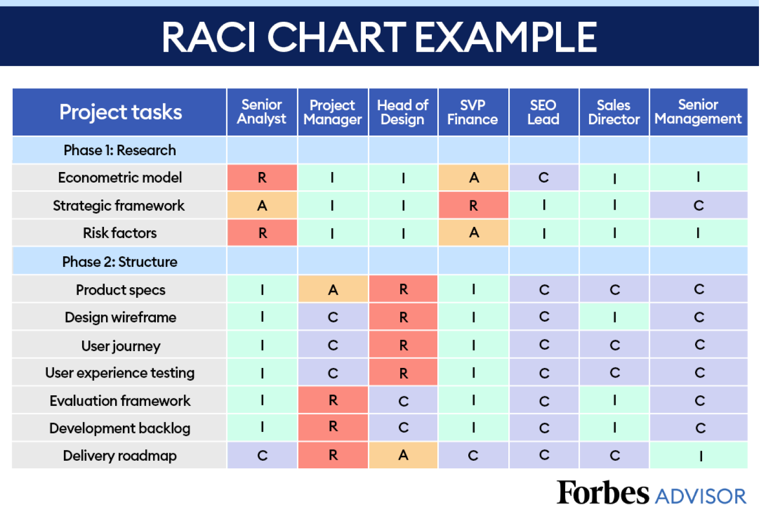
Here’s a breakdown of what the RACI Matrix translates into –
- R = Responsible for completing the task
- A = Accountable for the final outcome
- C = Consulted before decisions are made
- I = Informed about the task’s progress
My rules for creating an effective RACI matrix are:
- Assign only one “A” (Accountable) per task.
- Minimize “C” (Consulted) to avoid meeting overload.
- Keep “I” (Informed) lists focused and relevant.
By following these rules, I ensure accountability, streamline communication, and create a clear framework that drives projects to completion without role confusion.
Ideal Use Cases: Project teams with diverse roles, clarifying ownership of deliverables and decision-making authority.
Pros:
- Ensures clear ownership and communication of project tasks
- Helps you avoid confusion and duplication of efforts
Cons:
- Can become cumbersome for large teams or complex projects
- Requires ongoing maintenance as project roles evolve
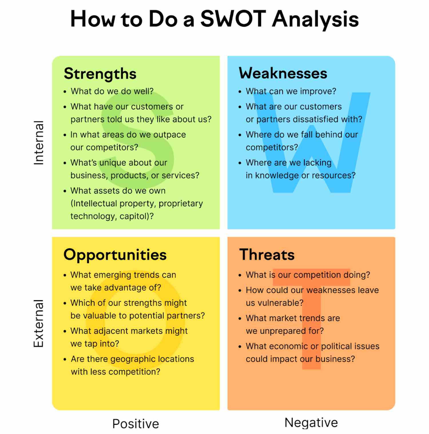
9. SWOT Analysis: Guiding Strategic Project Decisions
I rely on a SWOT analysis at the start of major projects and during key review points to evaluate internal strengths and weaknesses alongside external opportunities and threats. It forces honest conversations with stakeholders and surfaces factors that could derail the project or accelerate success.
I have used SWOT to guide decisions in market entry projects, competitive response strategies, and large‑scale product launches. When documented in a clear project management chart, SWOT becomes more than a brainstorming tool, it becomes a living reference that shapes strategy and aligns the team around the most important priorities.
Here’s an example of how to do a SWOT Analysis –
Ideal Use Cases: Project planning, business development, competitive analysis for product launches or marketing campaigns.
Pros:
- Provides a comprehensive view of your project’s competitive landscape
- Facilitates strategic decision making in project management.
Cons:
- Effectiveness relies on a team’s honest and objective evaluation
- Requires regular updates to remain relevant
10. Work Breakdown Structure (WBS): Your Project Blueprint
I think of the Work Breakdown Structure (WBS) as the backbone of a well-organized project. I begin with the main deliverable at the top, then break it down into smaller, more manageable components until every task is actionable and assignable. This structured approach ensures nothing slips through the cracks and everyone knows exactly what they are responsible for.
I rely on WBS when managing complex projects with multiple deliverables, defining scope with precision, and guiding teams that need a clear framework for large initiatives. It is one of the most effective project management charts for visualizing the hierarchy of work and communicating scope to stakeholders.
Here’s how a WBS will look for a construction project –
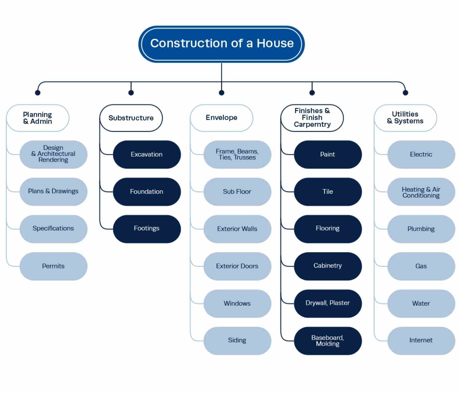
Here is my process for creating an effective WBS:
- Define the final deliverable.
- Identify major phases or components.
- Break each component into sub-deliverables.
- Continue until each task can be completed within 8 to 80 hours, which I have found to be the ideal range.
A strong WBS improves task delegation, strengthens accountability, and gives you the clarity to deliver projects on time and within scope.
Ideal Use Cases: Complex projects with multiple deliverables, ensuring a comprehensive scope of a project and facilitating task delegation.
Pros:
- Prevents scope creep through clear boundaries
- Facilitates accurate time and cost estimation
- Provides a foundation for other project management charts
Cons:
- Initial creation: 10-15% of project planning time
- Ongoing maintenance as scope evolves
- Team training for effective use
11. Timeline Schedule: Communicating the Big Picture
Sometimes stakeholders do not need every task detail; they just want to see when major milestones will be achieved. A timeline schedule is perfect for this. Unlike a detailed Gantt chart, it provides a clean, high‑level visual of key dates, dependencies, and decision points.
I use timeline schedules in executive briefings, client updates, and marketing launch plans. By keeping the focus on the big picture, I make it easy for decision‑makers to understand progress at a glance without getting lost in the details of more complex project management charts.
This straightforward approach is perfect for highlighting key project stages and deadlines. And it looks something like this –
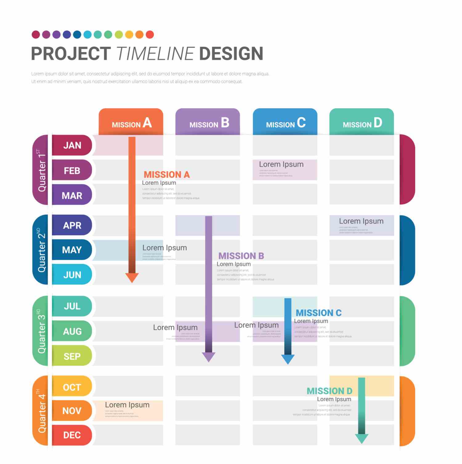
Ideal Use Cases: High-level project overview, communicating key milestones to clients or executives, project presentations.
Pros:
- Easy to understand and communicate project timelines to stakeholders
- Promotes transparency and milestone awareness
Cons:
- Limited detail on task dependencies or resource allocation
- Can become cluttered with too many activities
12. Pie Chart: Showing Resource and Budget Distribution
When I need to communicate how resources, budget, or time are divided among project components, a pie chart delivers that information instantly.
I keep the number of slices to seven or fewer, start the largest slice at 12 o’clock, and use clear labels with contrasting colors. In a project management table, pie charts work best for summarizing allocation decisions, making them ideal for budget reviews and resource planning sessions.
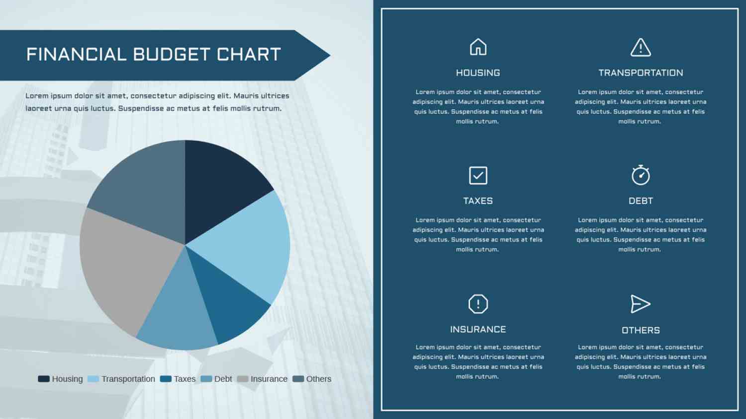
Ideal Use Cases: Presenting budget allocation, resource distribution across teams, and customer demographics (limited to a single variable).
Pros:
- Easy to understand for presenting proportional data
- Visually appealing way to showcase breakdowns of a single category
Cons:
- Limited to showcasing a single data set
- Can become cluttered with too many slices
13. Critical Path Method (CPM) Diagram: Finding Your Project’s Achilles’ Heel
The Critical Path Method (CPM) diagram is my go-to project management diagram when I need to pinpoint the tasks that can delay the entire project. It is a network-style project management chart that maps task dependencies and highlights the critical path, which is the sequence that determines your minimum project duration.
I turn to CPM diagrams for complex projects with many interconnected tasks, tight deadlines where delays carry a high cost, and resource-heavy projects that demand careful optimization.
In one software product launch I managed, CPM analysis revealed that completing the UI design was on the critical path. By assigning an additional designer, we accelerated the schedule and delivered the project two weeks earlier than planned.
A well-executed CPM diagram does more than identify bottlenecks. It gives you the clarity to focus resources where they matter most, avoid schedule slippage, and keep the entire project moving toward on-time delivery.
Here’s how a CPM diagram will look like if your project is…say, baking a cake –
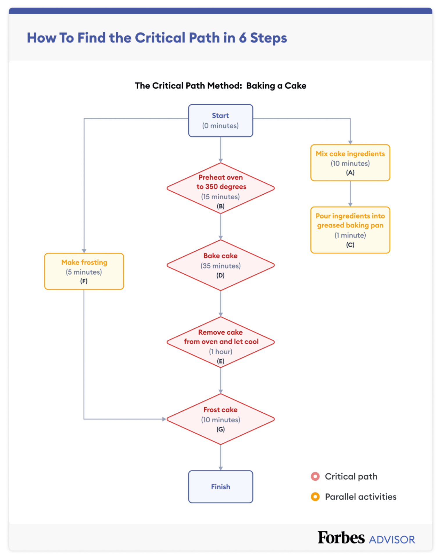
Ideal Use Cases: Large-scale construction projects, complex software development initiatives, and any project with critical deadlines and intricate task dependencies.
Pros:
- Identifies zero-slack tasks that could derail projects
- Helps optimize resource allocation
- Shows exactly where delays will impact completion
Cons:
- Requires specialized knowledge to create and interpret
- Time-intensive to set up initially
- Needs frequent updates as the project evolves
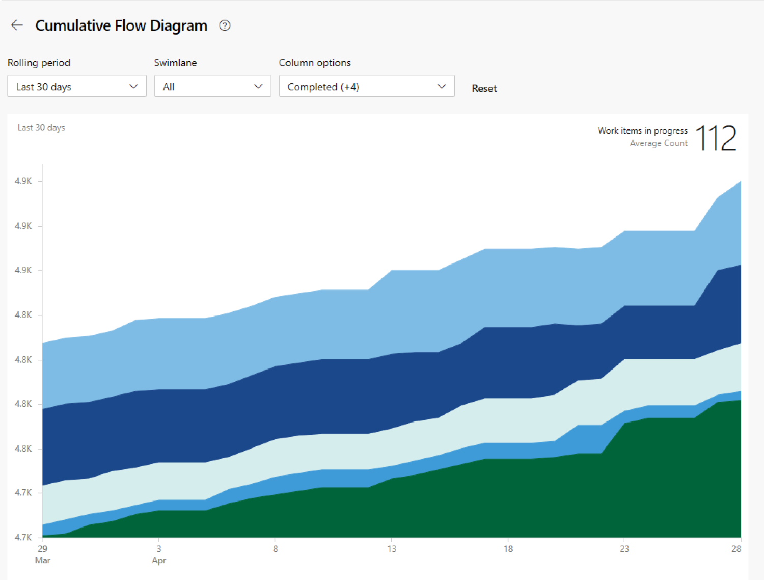
14. Cumulative Flow Diagram: Optimizing Workflow in Real Time
A cumulative flow diagram (CFD) helps me visualize how work is moving through stages over time. By tracking the number of items in each stage, I can see if tasks are building up in one part of the process, signaling a bottleneck.
CFDs give me the data to rebalance workloads, adjust resources, and smooth out delivery flow in agile teams, manufacturing lines, and content production pipelines. This is one of the few project management diagrams that not only shows current status but also reveals long‑term trends that could impact delivery speed and quality.
It looks something like this –
Ideal Use Cases: Agile benefits of project management methodologies, Kanban workflows, identifying bottlenecks, and optimizing workflow efficiency.
Pros:
- Provides valuable insights into workflow bottlenecks and WIP (work in progress) levels
- Facilitates continuous process improvement
Cons:
- Requires ongoing data collection
- May not be intuitive for everyone
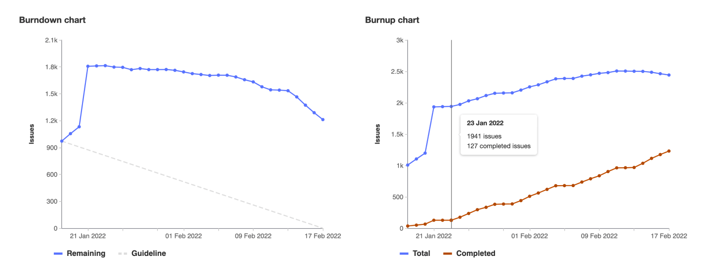
15. Burndown and Burnup Charts: Tracking Progress That Matters
I rely on burndown charts when I want my team to see exactly how much work remains and how quickly we are closing the gap. The ideal line trends toward zero as tasks get completed. Burnup charts flip the view, showing how much work has been delivered compared to the total scope.
I use burndown charts for sprint planning and deadline‑driven projects. Burnup charts are my choice when scope might change or in long‑term initiatives where progress needs to be shown alongside shifting goals. For stakeholder reporting, burnup charts clearly show value delivered. For team motivation, burndown charts highlight the finish line approaching.
Ideal Use Cases: Agile methodologies, tracking backlog completion in sprints, monitoring overall project progress towards deadlines.
Pros:
- Simple and easy to understand
- Offers real-time insights into project progress
Cons:
- Limited detail on individual tasks
- May not be suitable for complex projects with frequent scope changes
16. Network Diagram: Visualizing Complex Dependencies
A network diagram lets me map every task and its dependencies in a single visual. I can see predecessor‑successor relationships, identify parallel work paths, and spot critical paths that determine the shortest possible timeline.
This project management diagram is essential for complex projects like construction builds or multi‑system software integrations. It helps me anticipate scheduling risks, coordinate between teams, and make informed trade‑offs when resources or deadlines change.
Ideal use cases: Large‑scale construction projects, multi‑vendor IT implementations, enterprise‑level software integrations, and R&D initiatives with interdependent work streams.
Pros:
- Comprehensive dependency understanding
- Schedule risk identification
- Resource allocation optimization
- What-if scenario analysis
Cons:
- Requires systematic approach
- Can become visually overwhelming
- Needs regular maintenance
- Software tools essential for large projects
17. Milestone Chart: Highlighting Key Achievements
A milestone chart focuses on significant achievements, decision points, and deliverable completions. It strips away task‑level detail to emphasize the most important progress markers.
I use milestone charts in executive dashboards, client presentations, and compliance reporting. By selecting milestones that truly represent major accomplishments, I create a project management chart that communicates value and progress efficiently.
Ideal use cases: Executive project briefings, client progress updates, compliance or regulatory tracking, and high‑level program portfolio reporting.
Pros:
- Focuses attention on critical achievements
- Reduces information overload
- Facilitates celebration of progress
- Maintains stakeholder engagement
Cons:
- Detailed task planning behind milestones
- Resource allocation for achievement
- Dependency management between milestones
- Risk mitigation for critical paths
18. Resource Histogram: Balancing Workloads Effectively
A resource histogram shows me exactly how resources are allocated over time. I can instantly spot periods of over‑allocation, under‑utilization, or skill shortages that could hurt productivity.
When managing project teams, I map resource needs against availability, then level workloads to prevent burnout. I also use this chart to plan hiring, schedule contractor engagements, and time‑shift work to make better use of available capacity. This is a project management chart type that directly impacts team morale and efficiency.
Ideal use cases: Capacity planning for cross‑functional teams, contractor scheduling in construction or engineering, balancing workloads across agile squads, and identifying hiring or training needs.
Pros:
- Prevents team burnout through over-allocation
- Maximizes resource utilization efficiency
- Supports hiring and contracting decisions
Cons:
- Requires accurate capacity estimates
- Must account for skill differences
- Needs regular updates as the project evolves
19. Risk Matrix: Prioritizing Risks for Action
A risk matrix plots each identified risk by its probability and potential impact. This visual prioritization helps me decide which risks require immediate mitigation and which can be monitored over time.
I use risk matrices during project initiation, change reviews, and regular risk assessments. For example, high‑probability, high‑impact risks demand immediate attention, while low‑probability, low‑impact risks are documented and accepted. This project management diagram makes it easier to allocate risk management resources where they will matter most.
Ideal use cases: Early‑stage project planning, periodic risk review meetings, assessing the impact of scope or budget changes, and building contingency strategies for critical initiatives.
Pros:
- Focuses attention on highest-priority risks
- Facilitates resource allocation decisions
- Supports stakeholder risk communication
- Enables proactive rather than reactive management
Cons:
- Diverse stakeholder input improves accuracy
- Regular updates reflect changing conditions
- Quantitative analysis supports qualitative assessment
- Mitigation tracking ensures follow-through
Choosing the Right Project Management Chart: A Practical Decision Framework
After managing hundreds of projects, I’ve learned that the fastest way to improve outcomes is to match the project management chart type to the job you need done. Every chart or diagram has its own strength, and choosing the right one is less about preference and more about aligning it with your project’s priorities.
1. When timelines drive success: Use a Gantt chart to break down every phase and dependency in detail, then layer in a milestone chart for high‑level stakeholder updates that keep executives aligned without overwhelming them.
2. When you need process efficiency: A Kanban board gives your team real‑time visibility into task flow, while a cumulative flow diagram (CFD) exposes bottlenecks before they disrupt delivery.
3. When dependencies are complex: Critical Path Method (CPM) diagrams reveal the sequence that controls your project’s finish date, and network diagrams give you the big‑picture view of how every task connects.
4. When coordination is key: A RACI matrix eliminates role confusion, and a resource histogram ensures workloads stay balanced across your team.
5. When solving problems under pressure: A fishbone diagram helps you pinpoint root causes, while a Pareto chart prioritizes the few issues that will have the biggest impact once resolved.
6. When uncertainty is high: A PERT chart sets realistic completion ranges using probability‑based estimates, and a risk matrix helps you proactively decide where to invest your mitigation efforts.
By aligning your choice of project management chart with the real job your project needs done, you turn data into action, improve communication, and make decisions that keep you on track for on‑time, on‑budget delivery.
Implementation Strategy: Moving From Charts to Measurable Results
One of the fastest ways to derail a new project management system is to introduce every project management chart type at once. Teams get overwhelmed, adoption suffers, and the charts never deliver their full value.
I follow a phased approach that aligns chart adoption with the project’s immediate needs and maturity level:
- Phase 1 — Establish the core visualization
Select your primary working chart, typically a Gantt chart for timeline‑driven projects or a Kanban board for workflow‑driven ones. Make it part of the daily routine so your team develops fluency in reading and updating it. - Phase 2 — Strengthen communication
Once your primary chart is embedded in team culture, add charts designed for stakeholders, such as milestone charts or a concise SWOT analysis. These improve transparency and keep decision‑makers aligned without drowning them in operational detail. - Phase 3 — Optimize based on real data
After a month of consistent use, start incorporating charts that surface performance trends and bottlenecks, like cumulative flow diagrams or resource histograms. This is where you start fine‑tuning delivery speed and resource allocation. - Phase 4 — Layer in problem‑solving tools
As specific challenges arise, bring in analytical charts such as fishbone diagrams for root cause analysis or Pareto charts for targeted improvement efforts. These tools turn reactive firefighting into proactive improvement.
By sequencing chart adoption this way, you avoid overloading your team while building a system that evolves naturally from basic visibility to full‑scale performance management.
Drive Your Road to Success With the Best Project Management Charts
The gap between struggling project managers and those who consistently deliver isn’t about talent or luck; it’s about disciplined use of the right visual tools.
A well‑chosen project management chart brings clarity to chaos, aligns every stakeholder, and holds teams accountable from kickoff to delivery. Each chart type in this guide plays a distinct role in your project management toolkit.
The real advantage comes from selecting the right chart for the job, implementing it with intention, and keeping it updated throughout the project lifecycle.
Whether you’re guiding a small internal rollout or orchestrating a multi‑million‑dollar program, these 19 project management chart types will change the way you plan, communicate, and deliver.
Now it’s your move, start putting them into practice with tools like ProProfs Project, where Gantt charts, Kanban boards, and other essential project management diagrams are ready to help you deliver with confidence and speed.
Frequently Asked Questions

What’s the biggest mistake project managers make when combining multiple chart types, and how can I avoid it?
Chart overload, running too many project management diagrams without clear ownership, kills efficiency. Limit to three chart types, assign update responsibility, and keep a single source of truth. This ensures consistency and avoids wasted effort.
How do I choose between Agile‑friendly charts (like Kanban) and traditional charts (like Gantt) in hybrid project management?
Map predictable work to a Gantt chart and adaptive work to a Kanban board. Use a milestone chart to connect both for stakeholder visibility. This preserves clarity without forcing one method onto all work.
When should I stop using a project management chart and switch mid‑project?
Switch when the chart no longer drives decisions, is poorly maintained, or fails to reflect reality. For example, move from Gantt to Kanban when scope becomes volatile. Always explain the change and its benefits.
How do I maintain chart accuracy and adoption in remote or distributed teams?
Automate updates where possible and set a routine update schedule for all time zones. Use asynchronous‑friendly tools like Kanban boards and RACI matrices. Make updates valuable to each team member, not just management.
FREE. All Features. FOREVER!
Try our Forever FREE account with all premium features!